Wealth Inequality in America
Infographics on the distribution of wealth in America, highlighting both the inequality and the difference between our perception of inequality and the actual numbers. The reality is often not what we think it is. References: http://www.motherjones.com/politics/2011/02/income-inequality-in-america-chart-graph http://danariely.com/2010/09/30/wealth-inequality/ http://thinkprogress.org/economy/2011/10/03/334156/top-five-wealthiest-one-percent/ http://money.cnn.com/2012/04/19/news/economy/ceo-pay/index.htm
Top Bluesky Posts
Glad you brought up income inequality. This is an excellent and eye-popping visual of a recent history of the skyrocketing income inequality in the US. 6 minutes @taxwarroom.bsky.social @4taxfairness.bsky.social #wealthtax #taxthesuperrich www.youtube.com/watch?v=QPKK...
It has gotten exponentially worse since the days this video was made. That said, Elon's "wealth" is just Tesla shares and a shitload of Twitter debt held by Morgan Stanley. www.youtube.com/watch?v=QPKK...
And if anyone is confused about how this works, you need to watch this video: www.youtube.com/watch?v=QPKK...
Perhaps the best illustrated is this one: www.youtube.com/watch?v=QPKK...
youtu.be/QPKKQnijnsM?...


You may also like
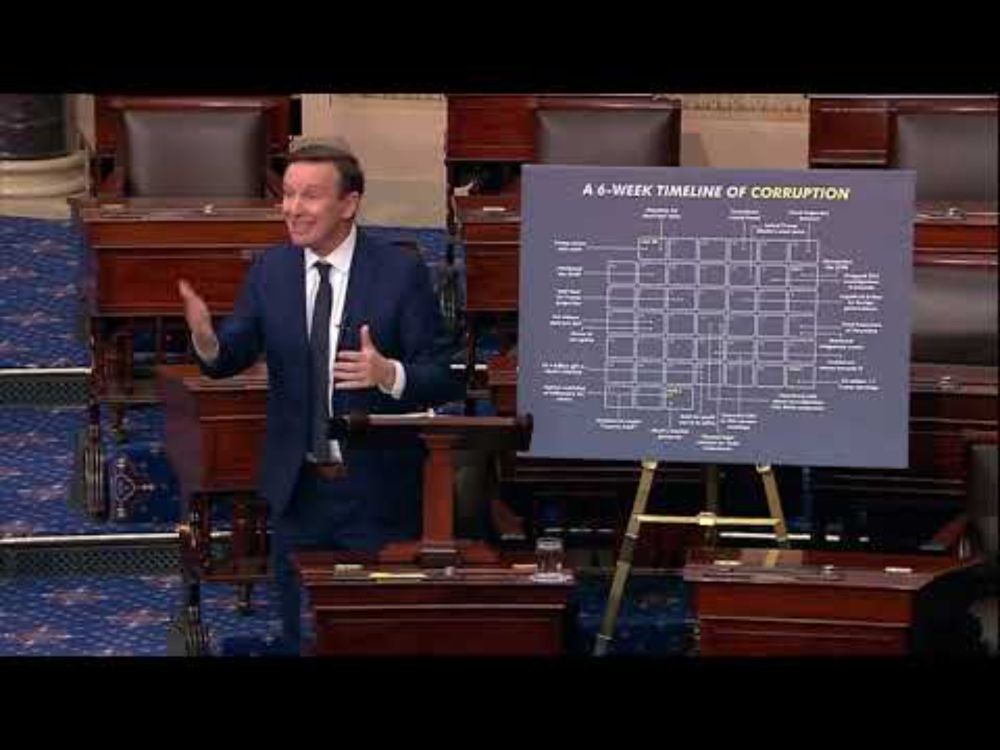
Murphy: Six Weeks In, This White House Is On Its Way To Being The Most Corrupt In U.S. History
Robert de Niro's 'Fuck Trump' speech at Tony awards
Analyse: Mit diesen Lügen stärkt Merz die AfD!
Donald Trump's 2014 Political Predictions
FDA unexpectedly cancels flu vaccine meeting
Why We Need a White History Month | The Amber Ruffin Show
Trump Claims His Tariffs Will Make Americans "So Rich"
[UTAU] Alex - francium
Trump Won't Rule Out Recession as Markets Plunge; Musk and Rubio Clash in White House: A Closer Look
Stocks take another tumble after Trump's weekend comments on inflation